


Would you say the moose is something like the camel of North America?
Take a look at our latest Facebook cover image and you’ll see why we ask.
It’s our second month featuring the work of Element designers on our Facebook page and digging into their creative process here on our blog.
For July, we’re featuring a design from Art Director, Shawn Williams.
Shawn joined the team in early 2016 after he caught our attention with a very unique follow up to his job interview.
He sent a thank you card featuring hand drawn artwork!
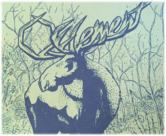
It shows a massive moose with antlers spelling out the word “Element.”
Needless to say, not only did Shawn’s thoughtful thank you impress us, so did his creativity and artistic talent.
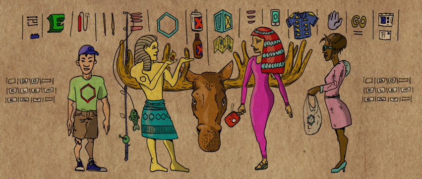
When we asked Shawn to come up with a cool concept for our Facebook, page, he turned away from his computer monitor and picked up a pen and some paper. Element mascot, Canuck the Moose, also makes a return appearance in a design that merges ancient Egypt with our agency culture.
How many recognizable elements of Element do you see in the image below?
Shawn’s Facebook Cover Image Design
Q: What’s the story behind your idea for this Facebook cover image?
Shawn Williams: I kicked around a number of ideas; brainstorming words and doodles and deciphering post-it notes from myself.
One thought was 100 hands reaching out towards the Element hexagram, but the tone was a little aggressive and idol worship didn’t feel right.
It’s not that often where a creative opportunity could have a hand drawn solution, so I knew I was going to draw something here. And, the name Element makes me think of a rich history, but what I like about the company is how lively and contemporary we are, so anachronistic hieroglyphics seemed like a fun and appropriate idea.
Q: Would you say you have a favorite artistic style or design technique? Did you use it in this graphic?
SW: Graphic design has so many different clients, multiple end users, separate goals – that I purposefully try not to have a design ‘style’ per sé.
However, in my illustration I’m generally more focused, where I suppose I have an alternative comic book art style.
My typical drawing process includes image research (including a mirror for facial expressions if needed), followed by loose penciling. Then I ink with a brush pen or Micron pens. At the inking phase, I consider light sources (shadow and cast shadows).
I dabble with cross-hatching and feathering, stippling, or scribbly lifework – dependent on the feel or tone of the overall product or subject matter. I’m more and more interested in textures and fine detail, but at the same time I try to push the initial image composition, giving life to characters and their environments. I then scan in inked drawings and do my coloring in Photoshop.
Q: Tell us about a professional or personal project that you’re proud of and what makes it unique.
SW: I did a freelance pro-bono rebranding for a refugee center in Italy a few years ago that I’m proud of, both the design and being a small part of the important work they do.
Note: Visit the Joel Nafuma Refugee Center website
I designed their logo, a few other related logos/identities to sister organizations, event invites, postcards, etc. They also took some of the work to make t-shirts, posters, hang tags for handcrafted items some of the refugees create and sell, and other things as well.
That’s one of the things I love about making art/design – that someone can see my art and it could inform people across the world, or be read by someone that I’ve not yet met, or perhaps inspire a young person in my hometown.
I also wrote and drew a 142 page graphic novel about becoming a father (Five Pounds & Screaming) that was, I think, a pretty cool gift I could give my daughter.
And, working with my own dad on spot illustrations and designing a book (Predicaments: Mostly True Hunting and Fishing Stories) that contains several of his best outdoor tales was really satisfying as well.
Q: If you could pick the brain of one artist or designer, who would it be and why?
SW: Daniel Clowes (Eightball, Ghost World, Art School Confidential, New Yorker covers) has a way of seemingly mastering: pencilling, inking, character design, writing, screenwriting, design, productivity, and relevance — while staying down to earth and humble. That inspires me.
########
Here’s a fun fact …
Independent filmmaker, Terry Zwigoff, who happens to be an Appleton, Wisconsin native, directed the movie versions of Daniel Clowes’ Ghost World and Art School Confidential.
Make sure to connect with Element on Facebook and LinkedIn where we’ll be sharing future stories including upcoming Designer Series Q&As!


