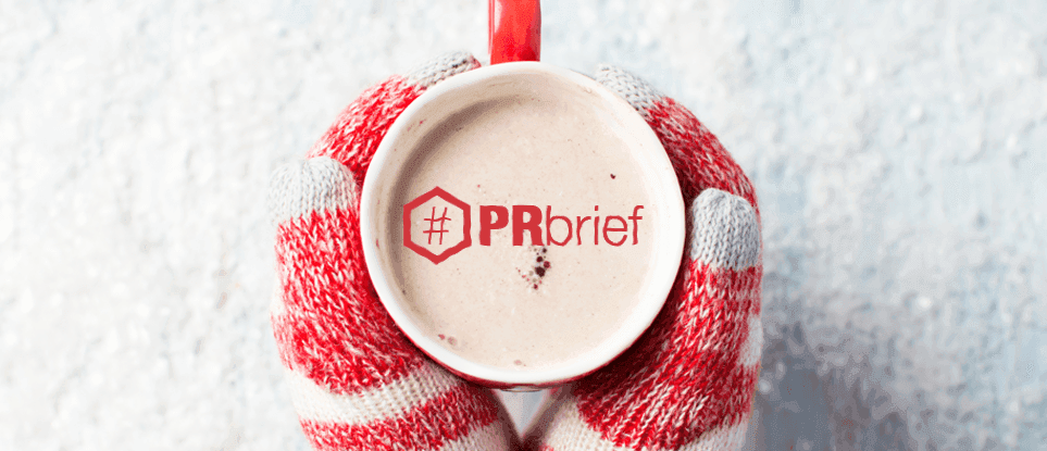

While it may be one of the most debated traditions each year, there is no seasonal feat of publicity greater than that of the Starbucks holiday cup. Each year, customers wait with great anticipation to see what the new holiday design will feature before standing in line to snap a pic of their cheery cup of coffee, spreading it across social media.
This week, we’ve decided to revisit Christmases past as we pick the brains of three design gurus. Let’s see which of the more than 20 cups these Element creatives chose as their favorite.
Neutral Design
Joel Haase – Art Director

After much deliberation, it came down to the 2007 design, which also recognized the 10th anniversary of the holiday cup. I really dig the design because it’s neutral to the season. The graphics reinforce connections made between people through something as simple as an outdoor activity, complemented with weathered textures that illustrate winter weather. The white cover and bottom landscape sandwich both the two-tone background and the logo’s pop of green, creating visual balance. The cup holder can now mentally and physically warm up with their Starbucks brew.
Custom Doodle Design
Jenna Garvin – Graphic Designer

My favorite Starbucks holiday cup design was by far that of the 2016 series. They took customer doodles from the simple 2015 cups and created a group of beautiful designs! I really appreciate the bold statement these cups made as they embraced not only the creativity of Starbucks’ customers but also the customers’ stories themselves.
Minimalist Design
Aaron Graff – Art Director

Dang, 2008 almost stuck it with that knit sweater design. It could have been really fun, but instead, they completely watered down the concept by adding the superficial white doodles. I like the added depth of the dark background tree in 2009, and 2015 gets some bravery points for its pure minimalism, of course.
But, if I have to choose just one, I’ll go all the way back to the deep purple of 1998. It still feels holiday, but in a unique way that stands out from the sea of red-with-thematic-doodles that saturate the season. If I had a say, I’d love to see a dark evergreen design with a few classy lights strung around it. When can Element take a crack at some designs?
Do you agree with the choices of our caffeinated crew? Let us know on Facebook, Twitter, LinkedIn, or send us a note! Be sure to check back for next week’s #PRbrief for our latest musings.